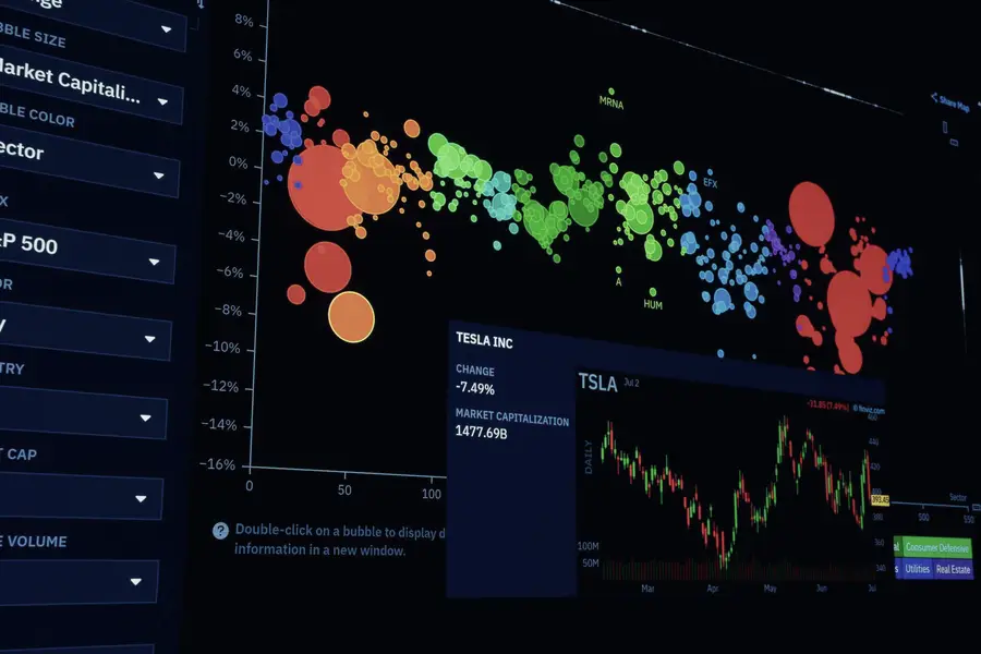
Data Visualisation in the Public Sector
3 days|Delivered on request
Data Visualisation in the Public Sector takes the discipline and works it through the constraints of this operating context, including DAX and calculated measures, spreadsheet controls and the compliance obligations that come with it. The sector framing is necessary because analysts are frequently self taught in the tool and untrained in the reasoning, and generic training rarely survives contact with the local rules. Delegates leave able to work confidently with pivot table analysis, self service analytics and statistical fundamentals in their own organisation.
What delegates leave able to do
- Make a decision about pivot table analysis without waiting for a specialist, measured against recognised data governance frameworks
- Take ownership of self service analytics rather than escalating it
- Put statistical fundamentals on a footing they can defend to a reviewer
- Improve data quality management within their own organisation
What the course covers
- DAX and calculated measures
- Spreadsheet controls
- Pivot table analysis
- Self service analytics
- Statistical fundamentals
- Data quality management
- Dashboard design
Who should attend
- business analysts
- team leaders responsible for KPIs
- professionals moving into analytics
- operations managers using dashboards